Instagrammable Food
With over 468 million posts labelled as “#food” on Instagram, 275 million as “#foodporn” and nearly 90 million with #foodphotography, it is doubtless that how a food looks is the first element that consumers, particularly Millennials and Gen-Zs, take into consideration upon consumption. According to consumer intelligence firm Maru/Matchbox, 68% of Millennials take a photo or a video of their food before eating it. Food has long ceased to be a way to feed ourselves, and has clearly become a lifestyle and a social status indicator.
Instagrammable food is a huge trend, it has been around for a while and has been accelerated with the pandemic and the almost universal return to home cooking. Foods (and beverages) are strong storytelling vehicles, how they are presented – and photographed – reflects individualism, creativity, and uniqueness. Every week, 45 to 50% of social media users are sharing food content on social media, with Millennials in particular constantly on the look for the perfect photograph, the perfect composition of superbly hued foods on perfect plates, in a perfect setting. And in the social media arena, where likes and saves and story shares are more important than the taste experience in itself – which cannot be shared on social! – the visual appeal of foods and beverages is key.
Psychology of Colours
It is certainly not surprising to read that what we eat – or drink – affects how we feel: choosing the right foods can certainly affect our physical health, but it can also help improve our mood, increase our vital energy, and even improve our brain function. When we talk about food choices, however, there is something that goes beyond the correct nutritional intake and the balance between starches, proteins, sugars, fibres, and vitamins: the first, and perhaps most important, point of contact with food is colour.
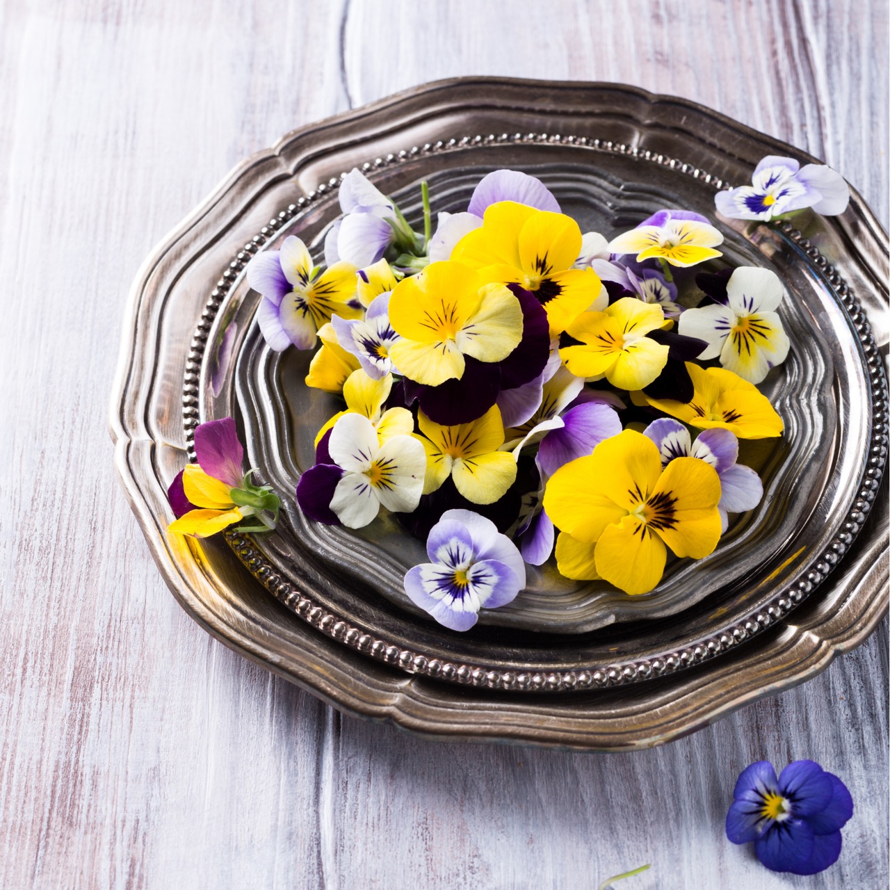
According to British psychologist Charles Spence, ‘Colour is the single most important sensory element intrinsic to a product when it comes to expectations about the taste experience of a food or drink’. Sight – and secondly smell – are the two most powerful senses when it comes to choosing what to eat or drink: we are certainly more attracted by a beautiful bright red jam (strawberries, or cherries, or raspberries) than by an amorphous grey one… and we can already taste the sweetness, the slight acid note, the persistence in the mouth. The choice of colour is therefore of the utmost importance when developing a new product: it is the business card that allows that product to act in the subconscious of the end consumer, who will associate that colour with an expectation of taste and, consequently, of mood. Winning products are always those that ‘tempt’ the taste buds by catching our eye. And according to various studies on the purchasing behaviour of modern consumers, disregarding consumer expectations by choosing ‘break’ colours may not be the winning choice: colour is part of the sensory information.
The Meaning of Colours
Red
Cherry red, strawberry red, hibiscus red, red beets, rosehips, red vine leaves, paprika, tomatoes: these are but some of the natural sources of betanin and lycopene that are at the very heart of the most intense and emotionally powerful of all colours. Red is a primary colour, and is traditionally linked to passion, as well as to danger. Curiously, it is also the colour that stimulates appetite.
Orange
The colour of oranges, carrots, squash, apricots and mango, cantaloupe, and sweet potato: orange is the colour of lutein and carotene, and is associated to feelings of creativity, adventure, enthusiasm, success, and balance. It is a secondary colour and comes from the balanced and harmonic blend of red and yellow.
Yellow
Yellow has always been the colour of the sun, but in nature we find it in yellow carrots, turmeric, saffron, safflowers, corn, and lemon zests: yellow inspires positivity, summer, optimism. Another of the primary colours, yellow is often associated with red to stimulate appetite and combine it to a sense of joy.
Purple
Purple carrot (or potato), purple cabbage, black grape: the darker they are, the richer in anthocyanins. They are the secret for the colour of creativity, but also of relief, harmony, and balance. It is often a colour linked to royalty, power, and luxury. Which natural raw materials provide us with purple pigments? Purple corn, purple carrot and potato, cabbage, blueberries, elderberries, black grape skin, to mention but a few.
Green & Brown
Green is the colour of nature “par excellance”: it is the colour of life of the chlorophyll running through the leaves, through the grass blades. It is associated with health, growth, generosity, and fertility. Brown is the colour of cocoa, caramel, but also the colour of soil and wood: again, this is a colour best associated with naturality, comfort, confidence, and is often combined with complementary colours such as green or yellow.
Blue & Black
Blue is the colour of the sea and the sky, and is linked to feelings of harmony, calmness, trust, but also freshness. Black is the colour of coal (vegetable): it is linked to intensity, sophistication, mystery, elegance.